https://www.elmorevillanueva.com/kendricklamar
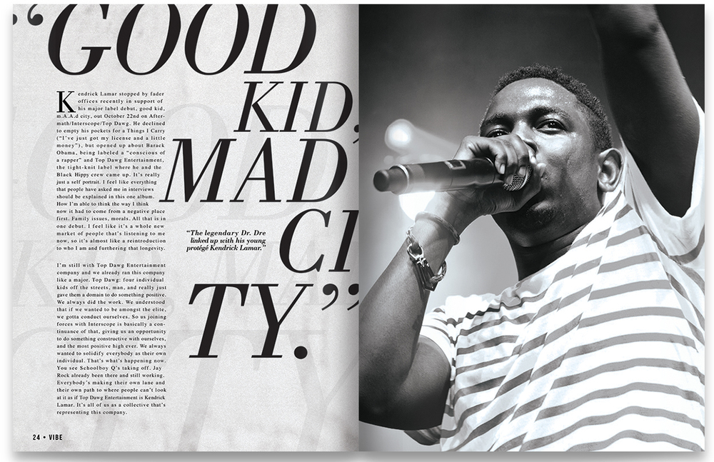
This magazine double spread is highlighting rapper Kendrick Lamar. Born and raised in Compton, California, the rapper writes poetically in his lyrics about his upbringing and how he was really just a good kid in a “mad city.”
I really love the design of this double spread. How the typography is placed, down to the black and white coloring, everything is pulled together to highlight Lamar and draw your eyes in on what his message is.
The typeface used is one that is an older look. You can see that the design was meant to look “retro” or “vintage.” Nostalgic, almost.

Rule of thirds is clearly used in the main portrait photo of Lamar. I love the depth featured as well in the spotlights in the back. You can also see the features vividly in his face, and the angle allows to see even the sweat on his face. This is highlighted below:

In addition to the main typography used, you can see that the bottom label as well as the main body used is a different font and different “vibe.” The main typeface used is “retro,” while the bottom left corner you can see is more modern. These two contrast each other immensely, which in turn, makes the main header stand out. You can also see the repetition in the back which reenforces the main message.

In these three photos below, I used shadow, color, rule of thirds, and backlight to mimic the original photo. The contrast in lighting is the main thing that is highlighted, that I wanted to show could work, even if swapped out with the original photo.


Overall, I believe that the design of this spread draws the viewers eyes to it, and catches your attention. I love that it highlights the retro vibe, as well as black and white features. I am a big fan of Lamar, and think that they did a great job representing him and his music in a way that fits his overall aesthetic.
